
4D Chart v13
Creating Graphs from Records in a Database (examples)
- 4D Chart
-
- Introduction to the language
-
- Locations for 4D Chart
- Referring to 4D Chart Documents
- Using the 4D Chart Default Area
- Referring to 4D Chart Objects
- Chart Data Types
- Handling 4D Chart Errors
- Creating Graphs from Records in a Database (examples)
- Creating Graphs from Arrays (examples)
 Creating Graphs from Records in a Database (examples)
This section provides examples for creating two- and three-dimensional graphs using the CT Chart selection and CT Chart data functions.
To learn about creating two- and three-dimensional graphs using arrays, refer to the section Creating Graphs from Arrays (examples).
In each example, you will find:
- A description of the situation used for the example,
- The structure of the example database,
- A graph that has been created entirely programmatically, using example data,
- The code used to create the example graph.
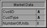
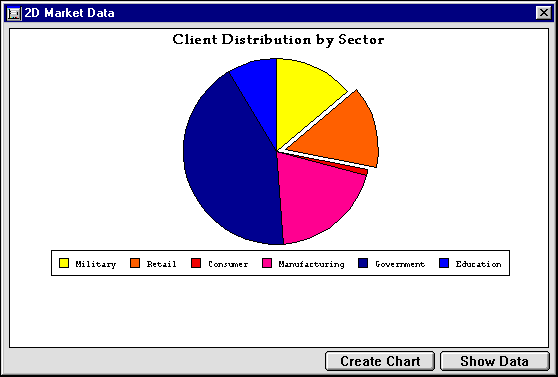
Suppose you own a software company that has clients in a wide variety of market sectors, from government to education to retail. Your database tracks your customers and sales.
Your database uses the following table to store the information:
Using 4D Chart, you produce the following pie chart. It illustrates the percentage of your total sales from each sector.
The following is the GRAPH PROFILE method, which was used to create the example graph.
  `Method: GRAPH PROFILE

  `Categories: Customer type

  `Values: Number of units purchased


 C_LONGINT($Left;$Top;$Right;$Bottom)

 C_LONGINT($Area;$Chart;$Title;$Locate)

 C_LONGINT($Left2;$Top2;$Right2;$Bottom2)


  `Generate the selection of records to chart

 ALL RECORDS([Market Data])


  `Array of fields for series data

 ARRAY LONGINT($aFields;1)

 $aFields{1}:=Field(->[Market Data]NumberOfUnits)


  `Hide interface elements

 CT SET DISPLAY(Area;1;0) `Hide menus

 CT SET DISPLAY(Area;2;0) `Hide Chart tools

 CT SET DISPLAY(Area;3;0) `Hide Object tools

 CT SET DISPLAY(Area;6;0) `Hide Scroll bars

 CT SET DISPLAY(Area;9;0) `Hide Rulers


  `Create a pie chart

 $Chart:=CT Chart selection(Area;6;1;1;Table(->[Market Data]);2;$aFields)


  `Explode piece #3 by 10 degrees

 CT EXPLODE PIE(Area;$Chart;2;10)


  `Set the legend position (bottom, horizontal orientation)

 CT SET LEGEND ATTRIBUTES(Area;$Chart;1;0;0;0;8;0;0)


  `Add a title at the top left hand corner

 $Title:=CT Draw text(Area;1;1;210;3;"Client Distribution by Sector")


  `Format title (Palatino, 14 point, Bold, Center, Black)

 $Color:=CT Index to color(16)

 $Font:=CT Font number("Palatino")

 CT SET TEXT ATTRIBUTES(Area;$Title;$Font;14;1;$Color;1)


  `Get area dimensions for centering

 CT GET AREA BOUNDARY(Area;1;$Left;$Top;$Right;$Bottom)


  `Resize the chart to window size minus 50 points

 CT SIZE(Area;$Chart;$Right-50;$Bottom-50)


  `Center chart

 CT GET BOUNDARY(Area;$Chart;$Left2;$Top2;$Right2;$Bottom2)

 $Locate:=(($Right-$Left)-($Right2-$Left2))/2

 CT MOVE(Area;$Chart;$Locate;$Top2)


  `Center title

 CT GET BOUNDARY(Area;$Title;$Left2;$Top2;$Right2;$Bottom2)

 $Locate:=(($Right-$Left)-($Right2-$Left2))/2

 CT MOVE(Area;$Title;$Locate;$Top2)


  `Move the Chart 9 points down

 CT GET BOUNDARY(Area;$Chart;$Left;$Top;$Right;$Bottom)

 CT MOVE(Area;$Chart;$Left;$Top+9)


  `Deselect all objects
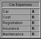
CT SELECT(Area;-1;0)Suppose that you are in the market for a new car and are using a database to determine the best car for your money. You have narrowed down your search to five cars and want to compare how much each car will cost for yearly registration, insurance, and maintenance.
You enter the data into the following table:
To analyze the information you have gathered, you decide to graph the information in a three-dimensional graph. Using 4D Chart, you produce the following graph:
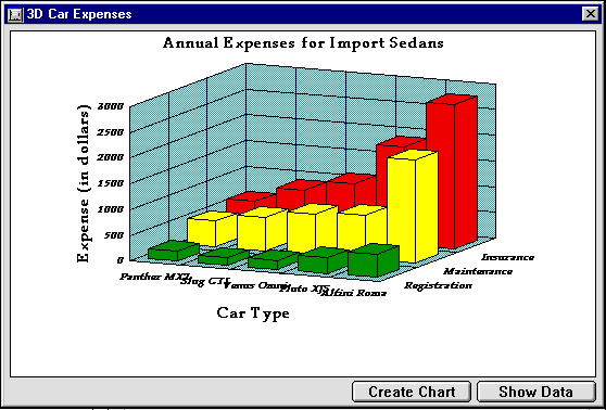
The GRAPH CARS method was used to create this graph. This method uses the CT Chart selection command. When you use CT Chart selection, you pass it an array of fields. The field names become the series names, and the values in the fields are graphed on the Values axis. In this example, the Registration, Insurance, and Maintenance fields were used for the series and values.
The following is the GRAPH CARS method.
  `Method: GRAPH CARS

  `Categories: Car Type

  `Series: Type of expense

  `Values: Cost in dollars


 C_LONGINT($Left;$Top;$Right;$Bottom)

 C_LONGINT($Area;$Chart;$Title;$Locate;$i)

 C_LONGINT($Left2;$Top2;$Right2;$Bottom2)


  `Generate the selection of records to chart

 ALL RECORDS([Car Expenses])

 ORDER BY([Car Expenses];[Car Expenses]Cost;>)


  `Array of fields for series data

 ARRAY LONGINT($aFields;3)

 $aFields{1}:=Field(->[Car Expenses]Registration)

 $aFields{2}:=Field(->[Car Expenses]Maintenance)

 $aFields{3}:=Field(->[Car Expenses]Insurance)


  `Hide interface elements

 CT SET DISPLAY(Area;1;0) `Hide menus

 CT SET DISPLAY(Area;2;0) `Hide Chart tools

 CT SET DISPLAY(Area;3;0) `Hide Object tools

 CT SET DISPLAY(Area;6;0) `Hide Scroll bars

 CT SET DISPLAY(Area;9;0) `Hide Rulers


  `Create a 3D Column chart

 $Chart:=CT Chart selection(Area;100;1;1;Table(->[Car Expenses]);1;$aFields)


  `Set up scale

 CT SET REAL SCALE(Area;$Chart;0;0;0;0;0;3000;500;100)


  `Do not display legend

 CT SET LEGEND ATTRIBUTES(Area;$Chart;0;0;-1;-1;0;0;0)


  `Add chart titles

 CT SET TITLE ATTRIBUTES(Area;$Chart;0;3;0;"Car Type")

 CT SET TITLE ATTRIBUTES(Area;$Chart;1;0;0;"") `do not show

 CT SET TITLE ATTRIBUTES(Area;$Chart;2;2;3;"Expense (in dollars)")


  `Add a title at the top left hand corner

 $Title:=CT Draw text(Area;1;1;300;3;"Annual Expenses for Import Sedans")


  `Format title (Palatino, 14 point, Bold, Center, Black)

 $Color:=CT Index to color(16)

 $Font:=CT Font number("Palatino")

 CT SET TEXT ATTRIBUTES(Area;$Title;$Font;14;1;$Color;1)


  `Set 1st series color/fill to green

 $Color:=CT Index to color(10)

 CT SET CHART FILL ATTRIBUTES(Area;$Chart;8;100;3;$Color)


  `Set 2nd series color/fill to yellow

 $Color:=CT Index to color(2)

 CT SET CHART FILL ATTRIBUTES(Area;$Chart;8;200;3;$Color)


  `Set 3rd series color/fill to red

 $Color:=CT Index to color(4)

 CT SET CHART FILL ATTRIBUTES(Area;$Chart;8;300;3;$Color)


  `Set fill attributes for all plot rectangles

 $Color:=CT Index to color(8)

 For($i;1;3)

    CT SET CHART FILL ATTRIBUTES(Area;$Chart;1;$i;5;$Color)

 End for


  `Set text attributes labels (Palatino, 9 point, bold italic)

 $Font:=CT Font number("Palatino")

 For($i;0;2)

    CT SET CHART TEXT ATTRIBUTES(Area;$Chart;4;$i;$Font;9;3;-1)

 End for


  `Set text attributes for titles (Palatino, 12 point, bold)

 $Font:=CT Font number("Palatino")

 For($i;0;2)

    CT SET CHART TEXT ATTRIBUTES(Area;$Chart;5;$i;$Font;14;1;-1)

 End for


  `Get area dimensions for centering

 CT GET AREA BOUNDARY(Area;1;$Left;$Top;$Right;$Bottom)


  `Resize the chart to window size minus 50 points

 CT SIZE(Area;$Chart;$Right-50;$Bottom-50)


  `Center chart

 CT GET BOUNDARY(Area;$Chart;$Left2;$Top2;$Right2;$Bottom2)

 $Locate:=(($Right-$Left)-($Right2-$Left2))/2

 CT MOVE(Area;$Chart;$Locate;$Top2)


  `Center title

 CT GET BOUNDARY(Area;$Title;$Left2;$Top2;$Right2;$Bottom2)

 $Locate:=(($Right-$Left)-($Right2-$Left2))/2

 CT MOVE(Area;$Title;$Locate;$Top2)


  `Move the Chart 9 points down

 CT GET BOUNDARY(Area;$Chart;$Left;$Top;$Right;$Bottom)

 CT MOVE(Area;$Chart;$Left;$Top+9)


  `Deselect all objects
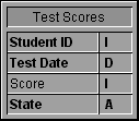
CT SELECT(Area;-1;0)Suppose you are Western Regional Director of an educational program, and you would like to compare standardized test scores for students in each state in your region on different test dates.
Your database contains the scores for students in your region, tagged by test date and home state.
Using 4D Chart, you create the following graph:
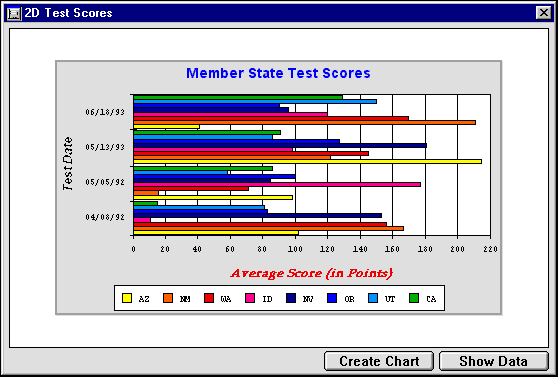
The preceding graph was created by the GRAPH SCORES 2D method. The following is the GRAPH SCORES 2D method:
  `Method: GRAPH SCORES 2D

  `Categories: Test Dates

  `Series: Member States

  `Values: Test scores


 C_LONGINT($Left;$Top;$Right;$Bottom)

 C_LONGINT($Left2;$Top2;$Right2;$Bottom2)

 C_LONGINT($Area;$Chart;$Title;$Locate;$Score;$Color;$Font;$Rect)


 ALL RECORDS([Test Scores])

 ORDER BY([Test Scores];[Test Scores]Test Date;>)

  `Hide interface elements

 CT SET DISPLAY(Area;1;0) `Hide menus

 CT SET DISPLAY(Area;2;0) `Hide Chart tools

 CT SET DISPLAY(Area;3;0) `Hide Object tools

 CT SET DISPLAY(Area;6;0) `Hide Scroll bars

 CT SET DISPLAY(Area;9;0) `Hide Rulers


  `Create a 2D bar chart

 $Chart:=CT Chart data(Area;2;1;1;1;Table(->[Test Scores]);2;4;3)


  `Make it a horizontal chart

 ARRAY LONGINT($aOptions;4)

 $aOptions{1}:=1 `orientation: horizontal

 $aOptions{2}:=0 `stacked: normal

 $aOptions{3}:=0 `Overlap:

 $aOptions{4}:=50 `Gap:

 CT SET CHART OPTIONS(Area;$Chart;$aOptions)


  `Show axis titles

 CT SET TITLE ATTRIBUTES(Area;$Chart;0;2;3;"Test Date")

 CT SET TITLE ATTRIBUTES(Area;$Chart;2;3;0;"Average Score (in Points)")


  `Format category axis title (Helvetica, Black, Bold italic, 12 point)

 $Color:=CT Index to color(16)

 $Font:=CT Font number("Helvetica")

 CT SET CHART TEXT ATTRIBUTES(Area;$Chart;5;0;$Font;12;3;$Color)


  `Format value axis title (Palatino, Red, Bold Italic, 12 point)

 $Color:=CT Index to color(4)

 $Font:=CT Font number("Palatino")

 CT SET CHART TEXT ATTRIBUTES(Area;$Chart;5;2;$Font;12;3;$Color)


  `Set the legend position to bottom center, horizontal orientation

 CT SET LEGEND ATTRIBUTES(Area;$Chart;1;0;0;0;8;0;0)


  `Add a chart title at the top left hand corner

 $Title:=CT Draw text(Area;1;1;350;3;"Member State Test Scores")


  `Format chart title (Geneva, 14 point, Bold, Center, Blue)

 $Color:=CT Index to color(7)

 $Font:=CT Font number("Geneva")

 CT SET TEXT ATTRIBUTES(Area;$Title;$Font;14;1;$Color;1)


  `Use custom scale

 CT SET REAL SCALE(Area;$Chart;0;0;0;0;0;220;20;5)

  `Get window dimensions to use for centering

 CT GET AREA BOUNDARY(Area;1;$Left;$Top;$Right;$Bottom)


  `Resize the chart to window size minus 50 points

 CT SIZE(Area;$Chart;$Right-50;$Bottom-50)


  `Center the chart horizontally

 CT GET BOUNDARY(Area;$Chart;$Left2;$Top2;$Right2;$Bottom2)

 $Locate:=(($Right-$Left)-($Right2-$Left2))/2

 CT MOVE(Area;$Chart;$Locate;$Top2)


  `Center the title horizontaly

 CT GET BOUNDARY(Area;$Title;$Left2;$Top2;$Right2;$Bottom2)

 $Locate:=(($Right-$Left)-($Right2-$Left2))/2

 CT MOVE(Area;$Title;$Locate;$Top2)


  `Move the Chart 10 points down from title

 CT GET BOUNDARY(Area;$Chart;$Left;$Top;$Right;$Bottom)

 CT MOVE(Area;$Chart;$Left;$Top+10)


  `Frame the chart and title with a grey rectangle

 $Rect:=CT Draw rectangle(Area;$Left-2;$Top2-2;$Right+2;$Bottom+2+10;0)

 CT SET FILL ATTRIBUTES(Area;$Rect;3;CT Index to color(13))

 CT SET LINE ATTRIBUTES(Area;$Rect;3;CT Index to color(15);1)


  `Center all objects vertically

 CT GET AREA BOUNDARY(Area;1;$Left;$Top;$Right;$Bottom)

 CT GET BOUNDARY(Area;-1;$Left2;$Top2;$Right2;$Bottom2)

 $Locate:=(($Bottom-$Top)-($Bottom2-$Top2))/2

 CT MOVE(Area;-1;$Left2;$Locate)


  `Send the rectangle to the back

 CT SELECT(Area;-1;0) `Deselect all

 CT SELECT(Area;$Rect;1) `Select rectangle

 CT DO COMMAND(Area;24002) `send to back

 CT SELECT(Area;-1;0) `Deselect all


  `Deselect all objects
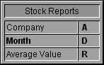
CT SELECT(Area;-1;0)Suppose you would like to know how your company’s stock is performing compared to other companies in your industry. You record the daily closing value of each company’s stock in a 4D database. In the example database, the stock values are recorded as monthly averages.
The following graph compares the value of Joe Bob’s Chemicals to the industry average. The data on the graph was taken directly from the database, without any manipulation.
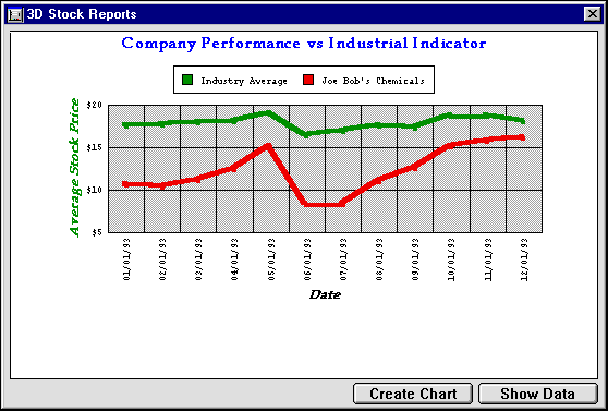
The STOCKS CHART method generates the graph using field values taken directly from the database. Since the values stored in the database are already calculated as averages, you do not need to perform any additional calculations. If you were recording daily values instead, you would need to calculate the monthly averages, store them in an array, and create the graph using the CT Chart arrays function.
For an example of averaging monthly values, see the section Creating a Two-Dimensional Graph from Arrays.
The following is the STOCKS CHART method:
  `Method: GRAPH STOCKS

  `Categories: Months of the year

  `Series: Company and Industrial Index

  `Values: Average stock price


 C_LONGINT($Left;$Top;$Right;$Bottom)

 C_LONGINT($Left2;$Top2;$Right2;$Bottom2)

 C_LONGINT($Area;$Chart;$Title;$Locate;$Font;$Color)


  `Generate the selection of records to chart

 ALL RECORDS([Stock Reports])

 ORDER BY([Stock Reports];[Stock Reports]Month;>)


  `Hide interface elements

 CT SET DISPLAY(Area;1;0) `Hide menus

 CT SET DISPLAY(Area;2;0) `Hide Chart tools

 CT SET DISPLAY(Area;3;0) `Hide Object tools

 CT SET DISPLAY(Area;6;0) `Hide Scroll bars

 CT SET DISPLAY(Area;9;0) `Hide Rulers


  `Create a 3D line chart

 $Chart:=CT Chart data(Area;101;2;1;1;Table(->[Stock Reports]);2;1;3)


  `Setup scale

 CT SET REAL SCALE(Area;$Chart;0;0;0;0;5;20;5;1)


  `Rotate the chart by 0 degrees in both directions

 CT SET 3D VIEW(Area;$Chart;0;0)


  `Set the plot recatangle fill/color (grey)

 CT SET CHART FILL ATTRIBUTES(Area;$Chart;1;1;5;CT Index to color(15))


  `Set the series fill/color (Green, Red)

 CT SET CHART FILL ATTRIBUTES(Area;$Chart;8;100;3;CT Index to color(10))

 CT SET CHART FILL ATTRIBUTES(Area;$Chart;8;200;3;CT Index to color(4))


  `Set the series line fill/color (Green, Red, 4 point)

 CT SET CHART LINE ATTRIBUTES(Area;$Chart;8;100;3;CT Index to color(10);4)

 CT SET CHART LINE ATTRIBUTES(Area;$Chart;8;200;3;CT Index to color(4);4)


  `Set the chart text attributes (Palatino, bold italic, 12 point)

 $Font:=CT Font number("Palatino")

 $Color:=CT Index to color(16) `black

 CT SET CHART TEXT ATTRIBUTES(Area;$Chart;5;0;$Font;12;3;$Color)

 $Color:=CT Index to color(10) `green

 CT SET CHART TEXT ATTRIBUTES(Area;$Chart;5;2;$Font;12;3;$Color)


  `Show axis labels

 CT SET LABEL ATTRIBUTES(Area;$Chart;2;3;0;"$###,##0")

 CT SET LABEL ATTRIBUTES(Area;$Chart;0;3;3;"##/##/##")

 CT SET LABEL ATTRIBUTES(Area;$Chart;1;0;0;"") `Hide these labels


  `Add category and value axis titles

 CT SET TITLE ATTRIBUTES(Area;$Chart;0;3;0;"Date")

 CT SET TITLE ATTRIBUTES(Area;$Chart;2;2;3;"Average Stock Price")


  `Set the legend position to top center, horizontal orientation

 CT SET LEGEND ATTRIBUTES(Area;$Chart;1;0;0;0;7;0;0)


  `Add a chart title at the top left hand corner

 $Title:=CT Draw text(Area;1;1;350;3;"Company Performance vs Industrial

 Indicator")


  `Format chart title (Palatino, 14 point, Bold, Center, Blue)

 $Color:=CT Index to color(7)

 $Font:=CT Font number("Palatino")

 CT SET TEXT ATTRIBUTES(Area;$Title;$Font;14;1;$Color;1)


  `Get area dimensions for centering

 CT GET AREA BOUNDARY(Area;1;$Left;$Top;$Right;$Bottom)


  `Resize the chart to window size minus 50 points

 CT SIZE(Area;$Chart;$Right-50;$Bottom-50)


  `Center chart

 CT GET BOUNDARY(Area;$Chart;$Left2;$Top2;$Right2;$Bottom2)

 $Locate:=(($Right-$Left)-($Right2-$Left2))/2

 CT MOVE(Area;$Chart;$Locate;$Top2)


  `Center title

 CT GET BOUNDARY(Area;$Title;$Left2;$Top2;$Right2;$Bottom2)

 $Locate:=(($Right-$Left)-($Right2-$Left2))/2

 CT MOVE(Area;$Title;$Locate;$Top2)


  `Move the Chart 10 points down

 CT GET BOUNDARY(Area;$Chart;$Left;$Top;$Right;$Bottom)

 CT MOVE(Area;$Chart;$Left;$Top+10)


  `Deselect all objects

 CT SELECT(Area;-1;0)
Product: 4D Chart
Theme: Introduction to the language
Creating Graphs from Arrays (examples)


